
Create dynamic and responsive layouts using multiple methods.
The CORE includes Blueprint Grid, a multi-method layout library built with Flexbox and CSS Grid. You'll only need to include the following CSS file:
bos/core/css/blueprintgrid.css
$blueprintgrid_css
This imports all necessary CSS components from the following directory:
bos/core/css/grids/
There are six layout methods included:
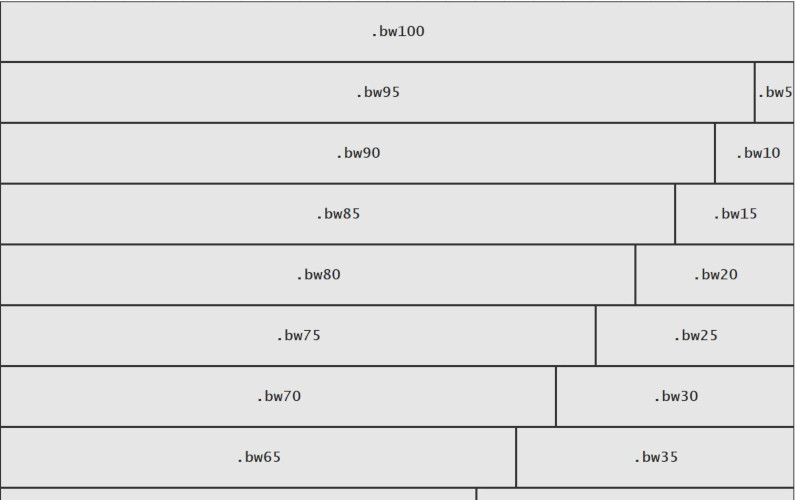
Blocks & Bricks Base Grid (B3Grid) is a Flexbox-based grid system that organizes elements into either rows or columns (one-dimensional layout).
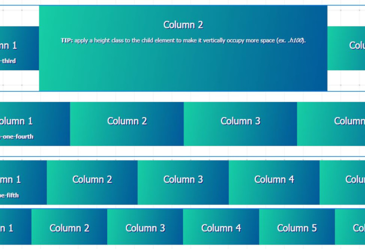
CSS Grid combines both rows and columns (two-dimensional) for a more efficient layout.
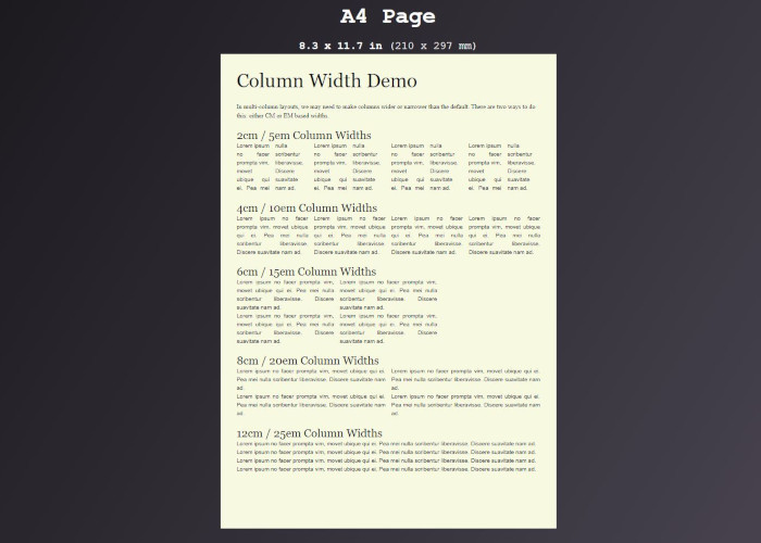
Intended primarily for printer-friendly content, Print Grid can be used to divide content up into columns. Create elements with up to 12 columns. Columns can have specified widths in either cm- or em-based units.
bos/core/jab/bento-grid.js
$bentogrid_js
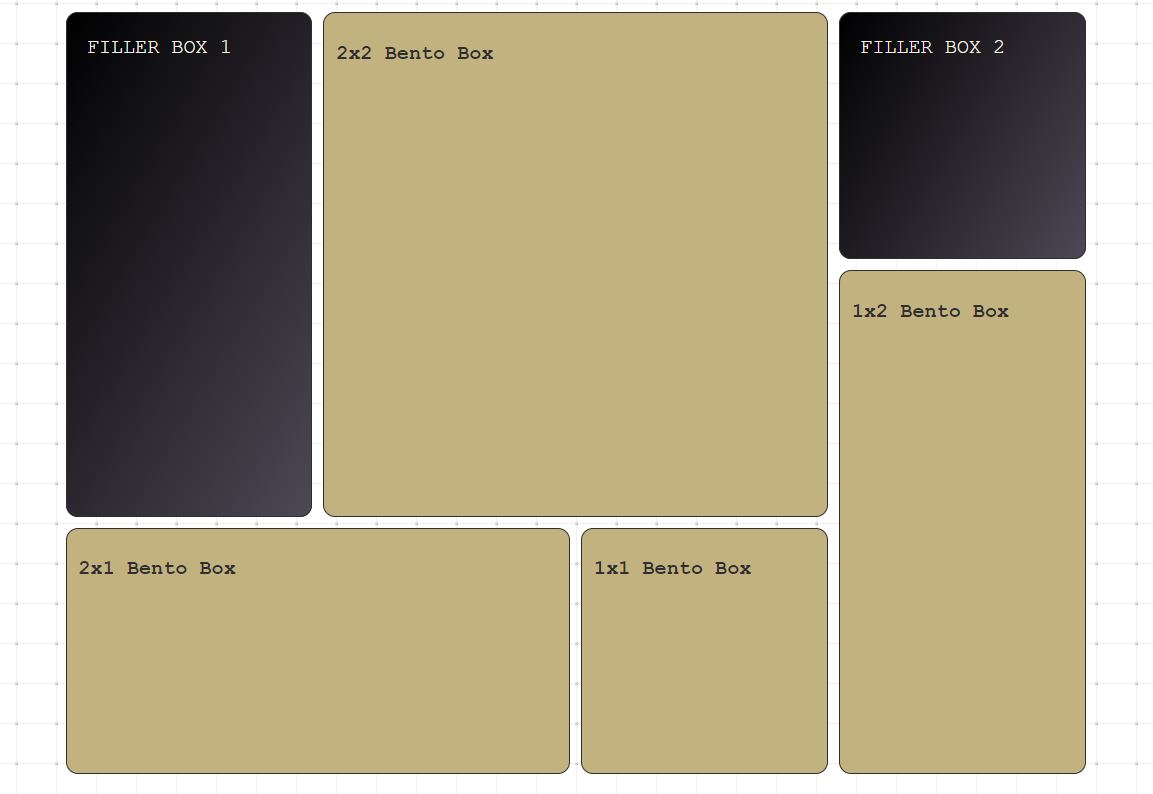
Bento Grid is a dynamic layout method that relies on vanilla javascript to generate a responsive two-dimensional layout using CSS Grid.
bos/core/jab/chaos-grid.js
$chaosgrid_js
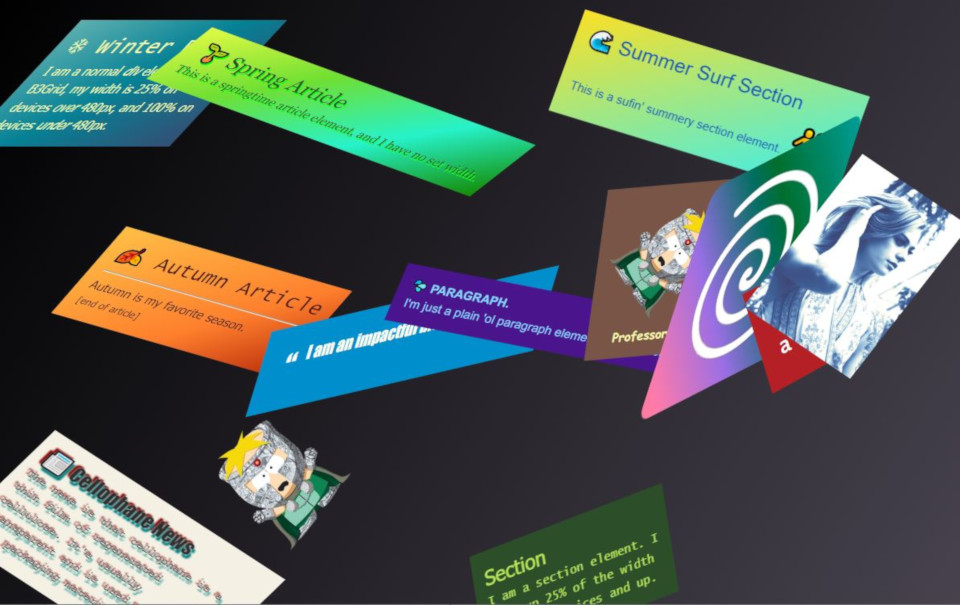
Elements are rendered as inline-blocks that are either relative- or absolute-positioned, and can be offset in various directions. Using vanilla javascript (optional), elements can be randomly positioned, skewed, and rotated.
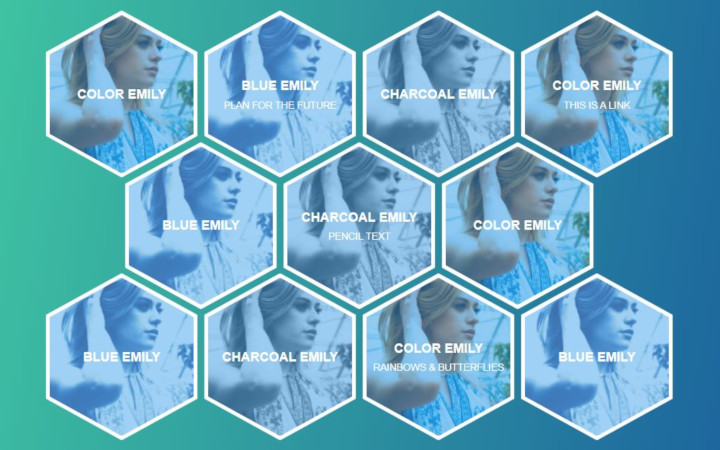
PolyGrids are creative grids that are comprised of items rendered as polygon shapes, allowing for a multi-dimensional appearance.
We can combine several methods by nesting elements, with one exception:
REMEMBER: It is NOT possible to nest CSS Grid items within Flexbox (B3Grid) elements! However... it is possible to nest Flexbox elements within CSS Grid items.
In the example below, we create a two-column Flexbox layout within two 2x1 Bento boxes (Flexbox nested within a dynamic CSS Grid layout). We also include a full-width block with a nested two-column text content area with double gap spacing (using Print Grid).
Lorem ipsum dolor sit amet, consectetur adipiscing elit, sed do eiusmod tempor incididunt ut labore et dolore magna aliqua.
Ut enim ad minim veniam, quis nostrud exercitation ullamco laboris nisi ut aliquip ex ea commodo consequat.
Lorem ipsum dolor sit amet, consectetur adipiscing elit, sed do eiusmod tempor incididunt ut labore et dolore magna aliqua.
Ut enim ad minim veniam, quis nostrud exercitation ullamco laboris nisi ut aliquip ex ea commodo consequat.