
BUTCH is a library of general-use classes for typography, layout, and other basic page elements.
bos/core/css/butch.css
$butch_css
.arial
.arial-black
.comic
.tahoma
.helvetica
.impact
.verdana
.courier
.lucida
.georgia
.times
.palatino
.normal
.bold
.heavy
.fineprint
.smaller
Normal size text
.larger
.huge
.center [centers text]
.left-align [aligns text to the left (default)]
.right-align [aligns text to the right]
.justify [justifies text]
.rtl [right-to-left]
.wm-lr [vertical writing mode left-to-right]
.wm-rl [vertical writing mode right-to-left]
.left [floats element to the left]
.right [floats element to the right]
.letterspace [character spacing using --charspace variable]
.spread [doubles character spacing using --charspace variable]
.compress [cuts character spacing by one-third using --charspace variable]
.oblique [Slants text]
.allcaps [Capitalizes all characters]
.lowercase [ALL LOWERCASE]
.capitalize [all words uppercased]
.smallcaps [Small caps font is displayed]
.spaced-2x [double spaced]
.spaced-3x [triple line spacing]
.spaced-4x [4x line spacing]
.tal-l [left-aligns last line of text]
.tal-r [right-aligns last line of text
.tal-c [centers last line of text]
.tal-j [justifies last line of text]
.indent [indents text by 1cm]
.nowrap [text will never wrap to next line]
.ws-sm [small word spacing]
.ws-md [medium word spacing]
.ws-lg [large word spacing]
.keep-all [word breaks are prohibited between pairs of letters]
.break-all [lines may break between any two letters]
.break [word wrap allows unbreakable words to be broken]
.guard [prevents text from being selectable]
.flow-text Flow-text makes your text responsive! The font size uses media queries, so it scales depending on the screen width.
This is a paragraph without flow-text applied.
Fluid-text is similar to flow-text in that the size scales in relation to the screen size. However, it does NOT make use of media queries. Rather, it uses a calculated scale range to determine the font size. Done in pure CSS!
.fluid-text
.fluid-text-h1
.fluid-text-h2
.fluid-text-h3
.fluid-text-h4
.fluid-text-h5
.fluid-text-h6
Address
Address Line 1
Blockquote
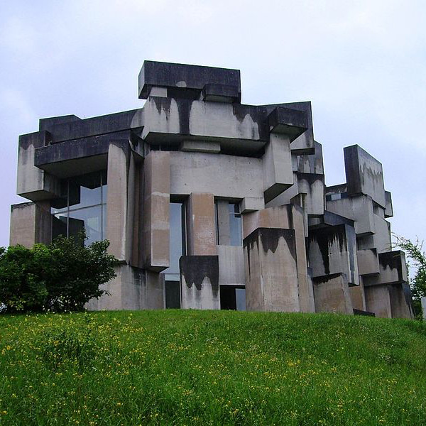
New brutalism, inevitably, in global dissemination, degenerated into a rough concrete style.
Description Lists
Unordered Lists
ul.disc
ul.diamond
ul.fisheye
ul.check
ul.heart
ul.circle
ul.triangle
ul.bullseye
ul.xmark
ul.sparkle
ul.square
ul.brutal
ul.lozenge
ul.arrow
ul.burst
ul.tags - makes ul li items display inline
ul.tags-hash - prepends a hashtag to tags
ul.tags-check - prepends a checkmark to tags
ul.tags-xmark - prepends an x-mark to tags
Ordered Lists
Default
ol.roman
ol.alpha
ol.none
Section Header Counter
The section header counter allows you to create auto-incremented section headers and sub-headers.
Counted heading tags need to be wrapped within a count class div. Sub-headings need to be wrapped within a subcount class div (that is also nested within a count element).
						<div class="count">

						 <h2>Heading</h2>

						 <h2>Heading</h2>

						  <div class="subcount">

						    <h3>Sub-heading</h3>

						    <h3>Sub-heading</h3>

						    <h3>Sub-heading</h3>
    ...

						  </div>

						 <h2>Heading</h2>
...

						</div>
Classes
.count h(1-5) - auto-increments H tags (1-5)
.subcount h(2-6) - auto-increments H tags (2-6)
.count-reset - resets count to 0
.subcount-reset - resets sub-count to 0
Flexbox
Flexbox is a one-dimensional approach to arranging items in rows or columns, allowing items to fill available space in order to prevent overflow. To create a Flexbox area, simply wrap div elements within an element with the class:
.flex
Flex Classes
Apply these additional Flexbox classes for additional control:
.column - arrange items into vertical columns
.start - place item(s) at beginning of container
.middle - place item(s) in middle of container
.end - place item(s) at end of container
.reverse - arrange items in reverse order (last to first)
.evenly - items will have equal spacing around them
.around - items will have space before, between, and after them
.between - items will have space between them
.stretch - items are stretched to fit the container
.baseline - items are positioned at the baseline of the container
.wrap-600 - [600px max-width container]
.wrap-960 - [960px max-width container]
.wrap-1200 - [1200px max-width container]
.wrap-1600 - [1600px max-width container]
Width Classes
Items wrapped within .flex containers should have a width specified. Percent widths are recommended. Apply these classes to flex child elements:
.half [50% width]
.third [33% width]
.two-thirds [67% width]
.fourth [25% width]
.fifth [20% width]
.sidebar [25% width]
.main [75% width]
Blueprint Grid
If a more robust layout grid is needed, take a look at our multi-method layout grid system.
Content Columns
Apply these classes to paragraphs or divs to create a multi-column layout. Ideal for long text areas and lists.
.col2 - 2 column layout
Lorem ipsum no facer prompta vim, movet ubique qui ei. Per no regione aliquid, ea mei nulla scribentur liberavisse. Vim cu tale ludus possit, discere suavitate nam ad. No verterem reprimique vix, phaedrum hendrerit an quo. Qui feugait apeirian ut, ne virtute numquam mandamus mea. Eos et enim dicant deterruisset. At nec ceteros mentitum, ex solum putent offendit per. Odio putent discere cu vim. Oportere disputationi ea mea. Per civibus constituam et, an feugait omittam mel, no suas quas doming qui. Sit aeterno numquam no.
.col3 - 3 column layout
Lorem ipsum no facer prompta vim, movet ubique qui ei. Per no regione aliquid, ea mei nulla scribentur liberavisse. Vim cu tale ludus possit, discere suavitate nam ad. No verterem reprimique vix, phaedrum hendrerit an quo. Qui feugait apeirian ut, ne virtute numquam mandamus mea. Eos et enim dicant deterruisset. At nec ceteros mentitum, ex solum putent offendit per. Odio putent discere cu vim. Oportere disputationi ea mea. Per civibus constituam et, an feugait omittam mel, no suas quas doming qui. Sit aeterno numquam no.
.col4 - 4 column layout
Lorem ipsum no facer prompta vim, movet ubique qui ei. Per no regione aliquid, ea mei nulla scribentur liberavisse. Vim cu tale ludus possit, discere suavitate nam ad. No verterem reprimique vix, phaedrum hendrerit an quo. Qui feugait apeirian ut, ne virtute numquam mandamus mea. Eos et enim dicant deterruisset. At nec ceteros mentitum, ex solum putent offendit per. Odio putent discere cu vim. Oportere disputationi ea mea. Per civibus constituam et, an feugait omittam mel, no suas quas doming qui. Sit aeterno numquam no.
More Column Classes
.col5 - 5 columns
.col6 - 6 columns
.col7 - 7 columns
.col8 - 8 columns
.col9 - 9 columns
Column Gaps
Add 10, 20, 30, 40, 50, or 60px gaps between columns.
.gap10
.gap20
.gap30
.gap40
.gap50
.gap60
EXAMPLE: White justified arial text within a 3-column layout with 30px gaps between columns, with double spacing and an indent.
<p class="white-t justify arial triple-col gap30 dbl-spaced indent">...</p>
Position and layer elements.
Positioning
.sticky [sticky positions element at top of container]
.fixed [fixed positions an element]
.fixed-t-l [fixed position at top left]
.fixed-t-r [fixed position at top right]
.fixed-b-l [fixed position at bottom left]
.fixed-b-r [fixed position at bottom right]
.absolute [absolute positions an element]
.relative [relative positions an element]
Layering
.layer-b [lowest z-index using --base variable]
.layer-l [low z-index using --low variable]
.layer-m [middle z-index using --mid variable]
.layer-h [high z-index using --high variable]
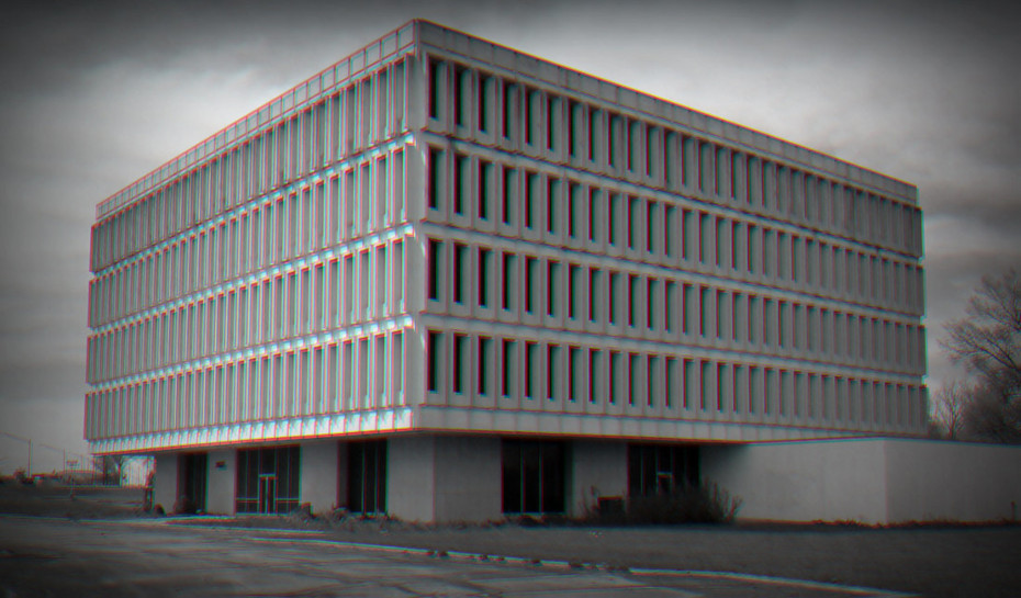
These classes are used for brutalizing your content. Apply them to any element.
Spacing Classes
.padded [applies --padding variable]
.no-padding [no padding on element]
.no-margins [no margin around element]
.confined [absolutely NO padding or margins]
.comfortable [enlarges --padding variable by 50%]
.uncomfortable [reduces --padding variable by 25%]
.solitary [applies --margins variable]
.sociable [applies --pullmargin variable]
.paranoid [applies --pushmargin variable to left and right of element]
.isolated [applies --pushmargin variable to top and bottom of element]
.spacer [applies --spacer height variable to element]
.spacer-tall [triples --spacer height variable]
Offsets
.pull-right [applies --pullmargin margin-right variable]
.pull-left [applies --pullmargin margin-left variable]
.pull-up [applies --pullmargin margin-top variable]
.pull-down [applies --pullmargin margin-bottom variable]
.push-right [applies --pushmargin margin-right variable]
.push-left [applies --pushmargin margin-left variable]
.push-up [applies --pushmargin margin-top variable]
.push-down [applies --pushmargin margin-bottom variable]
Scale Classes
.scale [applies --scalex variable to element]
.scale-3d [applies --scalex, --scaley, and --scalez variables to 3D transformation of element]
.scale-x [applies --scalex variable to scaleX transformation of element]
.scale-y [applies --scaley variable to scaleY transformation of element]
.scale-z [applies --scalez variable to scaleZ transformation of element]
Skew Classes
.skew [skews element along X and Y axis using --skewx and --skewy variables]
.skew-r [same as .skew, but multiplied by -1 (reversed)]
.skew-x [skews element along X axis using -skewx variable]
.skew-x-r [same as .skew-x, but multiplied by -1 (reversed)]
.skew-y [skews element along Y axis using -skewy variable]
.skew-y-r [same as .skew-y, but multiplied by -1 (reversed)]
Perspective Classes
.po [applies --origin variable (perspective origin)]
.po-c [centered perspective origin]
.po-l [left perspective origin]
.po-r [right perspective origin]
.perspective [applies --perspective variable]
Rotation Classes
.rr [rotate right using --rotatex variable]
.rl [rotate left using --rotatex variable (multiplied by -1)]
.rr-x [rotate right on X axis using --rotatex variable]
.rl-x [rotate left on X axis using --rotatex variable (multiplied by -1)]
.rr-y [rotate right on Y axis using --rotatey variable]
.rl-y [rotate left on Y axis using --rotatey variable (multiplied by -1)]
.rr-z [rotate right on Z axis using --rotatez variable]
.rl-z [rotate right on Z axis using --rotatez variable (multiplied by -1)]
Transformation Classes
.flip [flips element horizontally]
.flip-h [flip horizontally upon hover]
.flip-up [flips element vertically]
.flip-up-h [flip vertically upon hover]
Transform on Hover
To apply a transformation class upon hover, simply append a -h to a rotation, skew, or scale class. Examples:
.scale-h
.skew-y-r-h
.rl-y-h
OPACITIES
Make elements have opacity, or force a transparent background (ideal for PNG images).
Transparent background.

75% opacity.
50% opacity.
25% opacity.
Boundaries need to be respected. This includes brutal borders and rigid rules.
Basic Borders
Apply basic borders using these classes. To change the border color, see Flavors.
.b-s-t
Solid thin border
.b-s-k
Solid thick border
.b-s-f
Solid fat border
.b-d-t
Dotted thin border
.b-d-k
Dotted thick border
.b-d-f
Dotted fat border
.b-a-t
Dashed thin border
.b-a-k
Dashed thick border
.b-a-f
Dashed fat border
.b-b-t
Double thin border
.b-b-k
Double thick border
.b-b-f
Double fat border
Outlines
Add an outline border around any element. You can apply both borders and outlines to the same element. Similar to the border classes above, use o in place of the first b. Example: .o-s-t produces a solid thin outline.
Offset Outlines
Offset outlines around an element by 2, 5, 10, 15, or 20px:
.os-2
.os-5
.os-10
.os-15
.os-20
.bubblepop .b-d-f .o-d-f
fat dotted border and outline
.b-s-k .o-a-t .os-5
Solid thick red border with thin dashed blue outline, offset by 5px
.o-d-k .os-5
Strawberry-banana box with chocolate outline, offset by 2px
.b-a-k .o-s-t .os-5 .rounded
.b-a-t .o-a-t .os-2
Horizontal Rules
These apply the --accent color variable:
hr.sawtooth
hr.gradient
hr.dashed
hr.slash
These are hard-coded:
hr.central
hr.charlie
These allow for Flavor classes to be applied:
hr.fat
hr.thick
hr.thin
Gradient Borders
.love-b
.lush-b
.virgin-b
.frost-b
.sunset-b
.dusk-b
.shades-b
.river-b
.hottie-b
.slant-dark
.slant-light
.bevel
.emboss
.jagged
Creates a grey triangular border above and below an element.
.jagged-alt
Jagged alternative
Box Shadows
Apply these classes to add a box shadow. By default, box shadow colors use the --secondary color variable.
.box-s
.box-s-k
.box-s-f
.box-s-d
.box-s-t
.box-s-q
.box-s-p
.box-s-s
.box-s-l
.box-s-r
.box-s-a
.box-s-b
Shapes are simple CSS classes that can be applied to any element to make it into a shape. When floated left or right, a shape element can have content wrap around it.
To see examples and documentation, see the demo.
.circle
Applies 50% radius to any element. To create a perfect circle, specify an equal width and height. When applying float classes .left or .right, content will wrap around the circle.
.sketchbox
.rounded
Tables can be made responsive simply by applying the class .responsive directly to the table tag. On devices under 600px wide, each table row is displayed as a record. Re-size your browser window to see it in action.
| Client | Due Date | Amount | Status |
|---|---|---|---|
| Ma Pa Shop | 08/20/2017 | $1,165 | Paid |
| Creative Studio | 02/01/2015 | $2,167 | Collections |
| Food Bistro | 04/30/2020 | $978 | Good Standing |
| Repair Shop | 02/15/2019 | $15,500 | Unpaid |
To make an image fluid width so that it fits within any area, simply apply the class: .responsive.
Use the video tag, and the video will be fluid-width. If embedding a YouTube, Vimeo, or any other third-party video that uses an iframe, simply wrap the iframe embed code within a div with class .video.