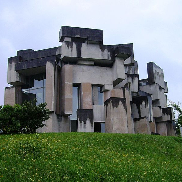
Win a trip to Ireland!
Win a trip to Sweden!
Win a Beer Party!

Elements for a brutal user interface and experience.
bos/core/css/buix.css
$buix_css
To create a button, simply use the button tag, or apply .btn class to a link. Buttons are displayed as an inline block, by default.
To make a button take up the full width of a container, apply this class:
These button classes use of the primary and secondary flavor CSS variables to define the colors.
These button classes use of the tertiary, accent and auxiliary flavor CSS variables to define the colors.
To have sharp corners on buttons and elements, simply add the class .sharp:
A pure CSS menu that displays an optional description upon hover over each item.
			<ul class="simple-nav">

			   <li><a href="#">List Item

			   <span class="desc">Description text</span></a>

			   </li>

			</ul>
REQUIRES:
bos/core/jab/buix/tree-list.js
$treelist_js
Create a nested tree list menu for unordered lists. Child items can be toggled. Each parent item will need to be wrapped in a span with class of parent. Unlimited child levels are supported.
			<ul class="tree-list">

			  <li><span class="parent">Parent Item</span>

			   <ul>
    <li>child item</li>

			   </ul>

			  </li>
</ul>
REQUIRES:
bos/core/jab/jquery.3.js
$jquery3
bos/core/jab/plugins/pagination.js
$pagination_js
Create a list of items within a pagination interface. Show 5, 10, 15, 20, or 25 items per page. Wrap the pagination interface within container with class .paginate-X, where X is either 5, 10, 15, 20, or 25.
				<div class="paginate-X">

				  <div class="items">

				    <div>item 1</div>

				    <div>item 2</div>...

				  </div>

				  <div class="pager">

				    <div class="firstPage">first</div>

				    <div class="previousPage">prev</div>

				    <div class="pageNumbers"></div>

				    <div class="nextPage">next</div>

				    <div class="lastPage">last</div>

				  </div>
</div>
Thumbnails allow you to display a list of images at a reduced size. Useful for galleries. Wrap img tags within a container with any of these classes:
		<div class="size-thumb">

		   <img src="URL" />

		   <img src="URL" /> ...
</div>
TIP: Thumbnail classes can also be applied directly to the img or picture tags.
Crop images into even squares (regardless of their original dimensions) by applying the .crop class in conjunction with any of the thumbnail classes!
We can also make circle thumbnails! Apply the .circle class in conjunction with .crop and any thumbnail size class:
.size-thumb.crop.circle


A brutally simple responsive audio player.
REQUIRES:
bos/core/jab/jquery.3.js
$jquery3
bos/core/jab/plugins/audio-player.js
$audio_player_js
Audio players use data attributes to specify a title and artist:
data-title: name of file
data-artist: name of artist / source
		<audio class="baudio" data-title="" data-artist="">

		  <source src="" type="audio/ogg">

		  <source src="" type="audio/mpeg">
</audio>
A brutally simple video player for self-hosted videos, with fullscreen viewer.
REQUIRES:
bos/core/jab/jquery.3.js
$jquery3
bos/core/jab/plugins/video-player.js
$video_player_js
Video players use data attributes to customize their appearance:
data-skin: default, minimal or compact.
data-color(optional): custom hex color
data-title(optional): title of video
data-overlay: use value 1 or 2
		<video src="" poster=""
  data-title=""

		  data-skin="default"

		  data-overlay="1"
  data-color="#ff0000">

		</video>
A simple plugin that allows the user to play / pause an animated GIF upon click or hover.
REQUIRES:
bos/core/jab/jquery.3.js
$jquery3
bos/core/jab/plugins/gif-player.js
$gif_player_js
Apply either of these classes to an img tag:
.gifplay: play upon click
.gifplay-h: play upon hover

Presenter is a touch-enabled, swipe-friendly content slider! Ideal for displaying presentational content.
Presenter is fluid-width, so it will fit within any area. You can add as many slides as you want. By default, Presenter loops back to the beginning / end.
The printer plugin makes a specific element easily printable, with a custom header and footer.
REQUIRES:
bos/core/jab/jquery.3.js
$jquery3
bos/core/jab/plugins/printer.js
$printer_js
Classes
.printer
wrap content to be printed within this class
.headprint
(optional) content to displayed as header
.footprint
(optional) content to displayed as footer
button onclick="printer();"
button to launch printer interface
PUC (Print Utility Classes)
.print-only
content is only displayed when being printed, but is hidden on screens
.screen-only
content is hidden from being printed, and is only visible on screens
.print-monochrome
applied only to print view, all text is black, and images are rendered in grayscale
			<div class="printer">
  content...

			</div>
<button onclick="printer();">Print</button>

			<div class="headprint print-only"><h1>Header</h1></div>

			<div class="footprint print-only"><p>Footer</p></div>
DEMO: Hit the "Print Now" button to print this section.
Aliquam faucibus luctus quam a placerat. Donec sit amet cursus ante. Nunc volutpat hendrerit orci non viverra. Nam iaculis vitae risus vel interdum. Phasellus tempus odio ac lectus efficitur, in porta ante vulputate. Suspendisse lobortis sem ligula, non pulvinar lectus dictum ut. Ut eu mi vitae felis semper placerat. Proin eget ante facilisis, faucibus ipsum mattis, volutpat libero. Curabitur tincidunt ex sit amet tellus tincidunt interdum a eget ipsum.
This text will NOT be printed.
Sed volutpat volutpat ligula at placerat. Integer ut hendrerit arcu. Praesent id massa et turpis laoreet dictum a laoreet justo. Donec semper magna nec sapien lobortis, tincidunt auctor nunc efficitur. Nullam in massa dictum, hendrerit sem et, lacinia odio.
Footer print test
Interactions are elements that enhance user experience.
Make any element have a specific cursor type, or make any element rezizeable by the user!
Apply these classes to any element. Hover for preview.
Apply these classes to make any element resizeable by the user.
REQUIRES:
bos/core/jab/buix/link-previewer.js
$link_previewer_js
Add hoverable video and image previews to any element.
Markup is simple! Simply apply the class .ph and a data-src attribute, like so:
<element class="ph" data-src="./file-url"></element>
Supported File Types: .jpg, .jpeg, .png, .ico, .gif, .svg, .bmp, .webp, .mp4, .webm
Demo: Hover over each of the elements below.
Reveal.hover reveals hidden content upon hovering over an element!
The reveal container starts at a maximum width of 50% of the container it is wrapped within, and enlarges to 100% width upon hover while also revealing a caption.
.reveal (wrap content within this class)
.secret (hidden content to be revealed upon hover)
Hover Over Me!
I'm a SECRET!
SECRET - only visible upon hover!
Reveal.toggle toggles content upon clicking on a label.
You will need a unique ID for each reveal toggle element. Clicking on the label either opens or closes the toggled content. Use the markup as follows:
					<div class="reveal toggle">

					  <input id="unique-id-1" class="toggle" type="checkbox">

					  <label for="unique-id-1" class="label-toggle">

					  <div class="toggle-content">

					  ...content...
  </div>
</div>
REQUIRES:
bos/core/jab/jquery.3.js
$jquery3
bos/core/jab/plugins/draggable.js
$draggable_js
Make any element draggable! Simply apply the class .draggable to any element.
Draggable Modals
Make a modal draggable just by adding the class draggable to the modal inner wrapper:
.modal-inner.draggable
In the example below, we have two draggable brick elements, which can be dragged anywhere, including outside of the bricks container.

REQUIRES:
bos/core/jab/jquery.3.js
$jquery3
bos/core/jab/plugins/cdp.js
$cdp_js
Display content when an option is selected.
				<div class="cdp-wrap" id="unique-id">

				  <select class="cdp_select">

				    <option value="0">Content 1</option>

				    <option value="1">Content 2</option>

				    <option value="2">Content 3</option>...

				  </select>


				  <div class="content">

				    <div class="cdp-element" data-option="0">
...Option 1 Content...</div>

				    <div class="cdp-element" data-option="1">
...Option 2 Content...</div>

				    <div class="cdp-element" data-option="2">
...Option 3 Content...</div>

				  </div>
</div>
REQUIRES:
bos/core/jab/jquery.3.js
$jquery3
bos/core/jab/plugins/b-loader.js
$b_loader_js
Load more list items upon button press!
Simply create a list of div, p, li or article elements, wrapped within a .b-loader class container!
By default, b-loader displays 5 items at a time. This can be modified in the start.brutalizing.js initialization script.
To hide the counter within the "load more" button, add the class no-counter to the b-loader wrapper.
List Item 5 (Paragraph)
List Item 10 (Paragraph)
List Item 20 (Paragraph)
REQUIRES:
bos/core/jab/buix/h-scroll.js
$hscroll_js
H-Scroll is an interactive element that allows the user to horizontal scroll content by holding down buttons on either side of the scrollable content.
			<div class="h-scroll">

			  <button class="h-scroll-btn h-scroll-btn-left">left</button>

			    <ul class="h-scroll-list">

			      <li>ITEM 1</li>

			      <li>ITEM 2</li>

			      ...

			    </ul>

			    <button class="h-scroll-btn h-scroll-btn-right">right</button>

			</div>
Hide Scroll Bar
To hide the scroll bar, apply the class .hide-scrollbar to the h-scroll wrapper, so that:
.h-scroll.hide-scrollbar
litterbox
Spice expands
consciousness.
water fairies being wet
I'm a Fluid-Text Example
Modals are popup boxes that open when a user clicks on a link. There are two types of Modals: Vanilla and Lite.
REQUIRES:
bos/core/jab/buix/modal.js
$modal_js
Vanilla modals use plain vanilla javascript (no dependencies). Display a modal with any type of content. Users can close the modal either by clicking anywhere outside of it, or the X in the top right corner. There are three components that are needed.
Wrap your content within this markup. This is what will be displayed within the modal. NOTE: Content will need to be set to a max-width.
					<div id="unique-modal-id" style="display: none;">


					 ...content...


					</div>
This only needs to be included ONCE on the page. It loads the modal content within it. Place this after the main body content, but before any script tags.
					<div class="modal">

					 <div class="modal-inner">

					  <span data-modal-close>×</span>

					  <div class="modal-content"></div>

					 </div>

					</div>
Simply create a link with a unique ID and data-modal-open attribute to launch the modal.
<a href="unique-modal-id" data-modal-open>Open Modal</a>
Pure CSS modals for simple and lightweight content!
Wrap your content within this markup.
<div id="unique-id" class="modal-lite">
<a href="javascript:history.go(-1)" class="close">✖</a>
<div class="modal-content">
<div class="header">..heading..</div>
<div class="body">
..body content..
</div>
<div class="footer">..footer..</div>
</div>
</div>
Just link to the corresponding unique ID!
<a href="#unique-id">Launch Modal</a>

Customize
By default, no backgrounds or other colors are applied. Apply any flavors classes as necessary to any of the modal elements.
Closing Modals
Optionally link the modal footer button to a unique ID within the page, so the user is returned to a specific point on the page.
Fullscreen
To create a fullscreen modal, apply the class .full to the .modal-content container.
Scrollable
Ideal for fullscreen modals, make the modal body content vertically scrollable by applying the class .scroll-y to the .modal-content .body container.
 These tabs are purely CSS-based, and use variables to control the default colors.
Multiple groups of tabs can be placed on the same page.
This tab has a 2-column layout using the flexbox.
							<div class="tabs"> /* outer wrapper */

							/* Tab 1 */

								   <input type="radio" name="tabgroup1" id="tab1" checked="checked">

								   <label for="tab1" class="">Tab One</label>

								   <div class="tab">

								         ...content...

								   </div>

							/* Tab 2 */

								   <input type="radio" name="tabgroup1" id="tab2" checked="checked">

								   <label for="tab2" class="">Tab One</label>

								   <div class="tab">

								         ...content...

								   </div>

								</div>
This is the 2nd set of tabs on this page. Below is a 2-column justified paragraph:
Lorem ipsum dolor sit amet, consectetur adipisicing elit, sed do eiusmod tempor incididunt ut labore et dolore magna aliqua. Ut enim ad minim veniam, quis nostrud exercitation ullamco laboris nisi ut aliquip ex ea commodo consequat. Duis aute irure dolor in reprehenderit in voluptate velit esse cillum dolore eu fugiat nulla pariatur. Excepteur sint occaecat cupidatat non proident, sunt in culpa qui officia deserunt mollit anim id est laborum. Lorem ipsum dolor sit amet, consectetur adipisicing elit.
When applying custom CSS to a specific group of tabs, specify styles according to their group name:
/* tabs */
.tabs input[name="groupname"] + label {}
/* selected tab */
.tabs input[name="groupname"]:checked + label {}
/* tab content */
.tabs input[name="groupname"]:checked + label + .tab {}
